Brief
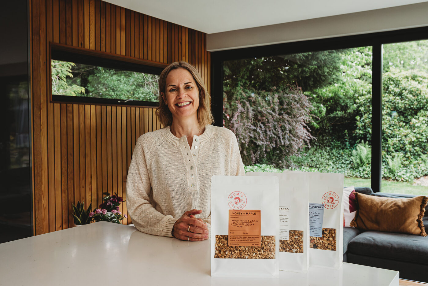
Mum's Granola is exactly what it sounds like. Esther, mum to one of the Berry Boys founders, started making granola at her kitchen table when her son could not find one for the açaí bar that was natural, properly made and genuinely tasted good. It became the granola Berry Boys serves. By the time it came to us it had a name, three flavours, a finished brand identity, and no shop of its own.
The brief was to give a hand-made, kitchen-table product a real storefront without losing what makes it hers. It had to sell properly, with checkout, subscriptions and bundles, but it had to feel like a story first and a shop second. And mum had to be able to run it herself, with no developer on call.
Approach
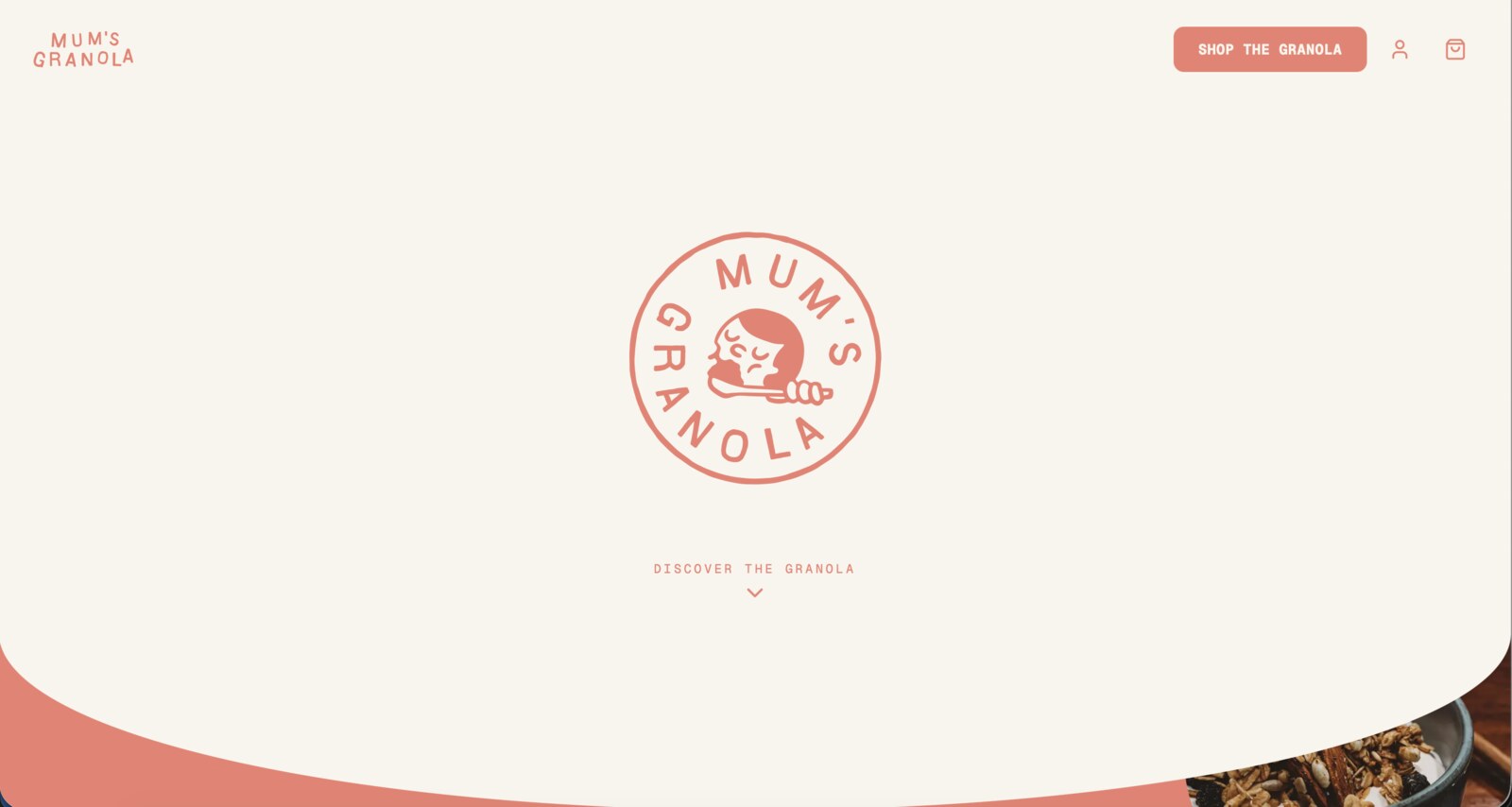
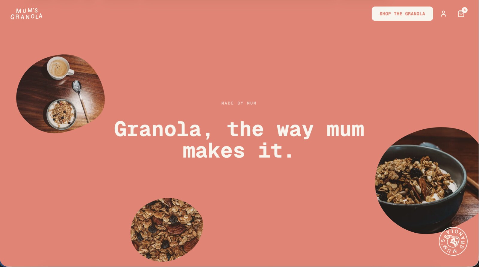
We built a single-page, scroll-led storefront in Next.js on a headless Shopify backend. The page opens on a milk cover with the stamp, which lifts away as you scroll into a continuous coral world: the mission, the story of how it started, then the flavours, the build-your-own box, the why, and the questions, all as one journey rather than a stack of pages. Story leads, and the shop arrives when you are ready for it.
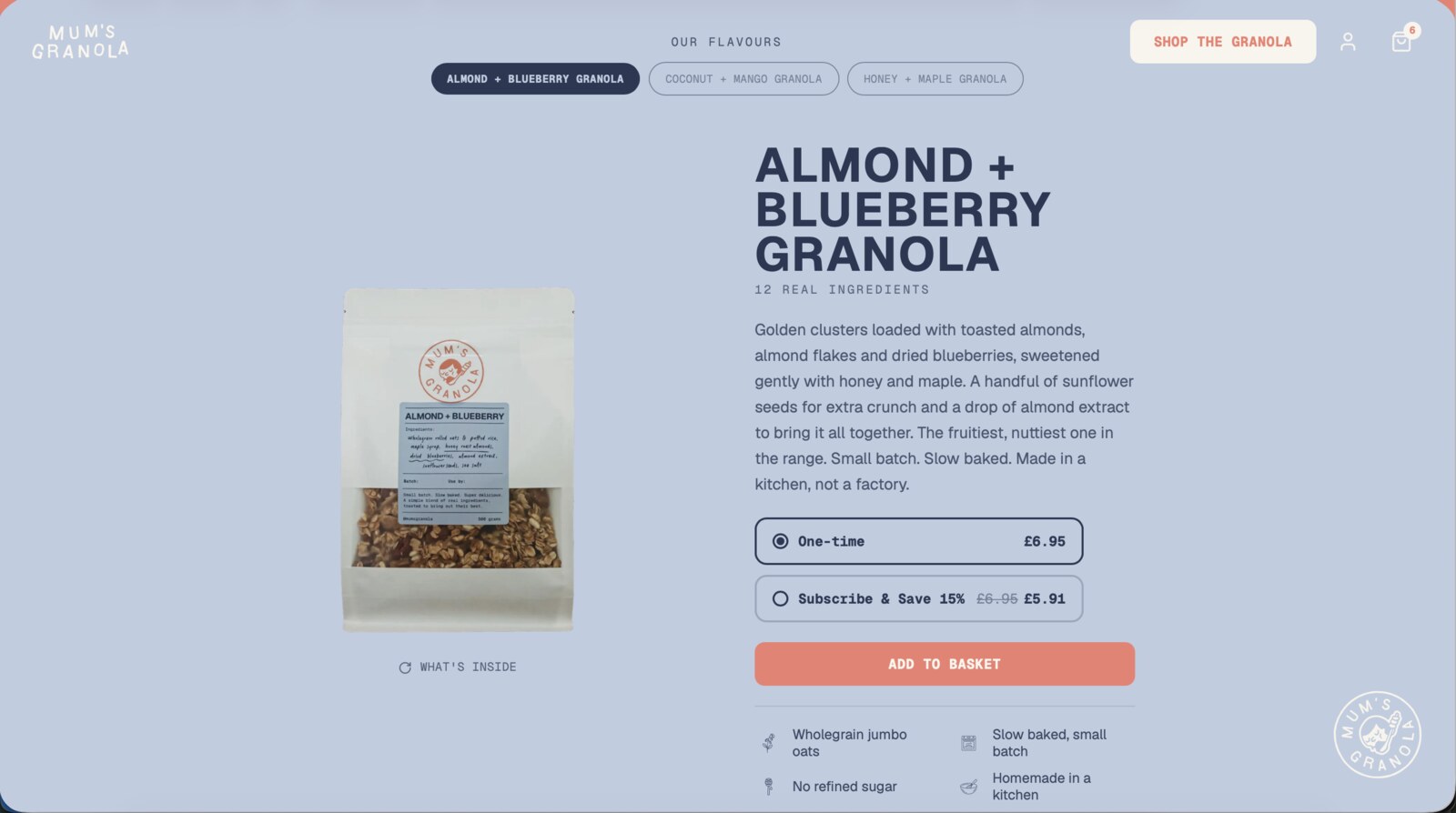
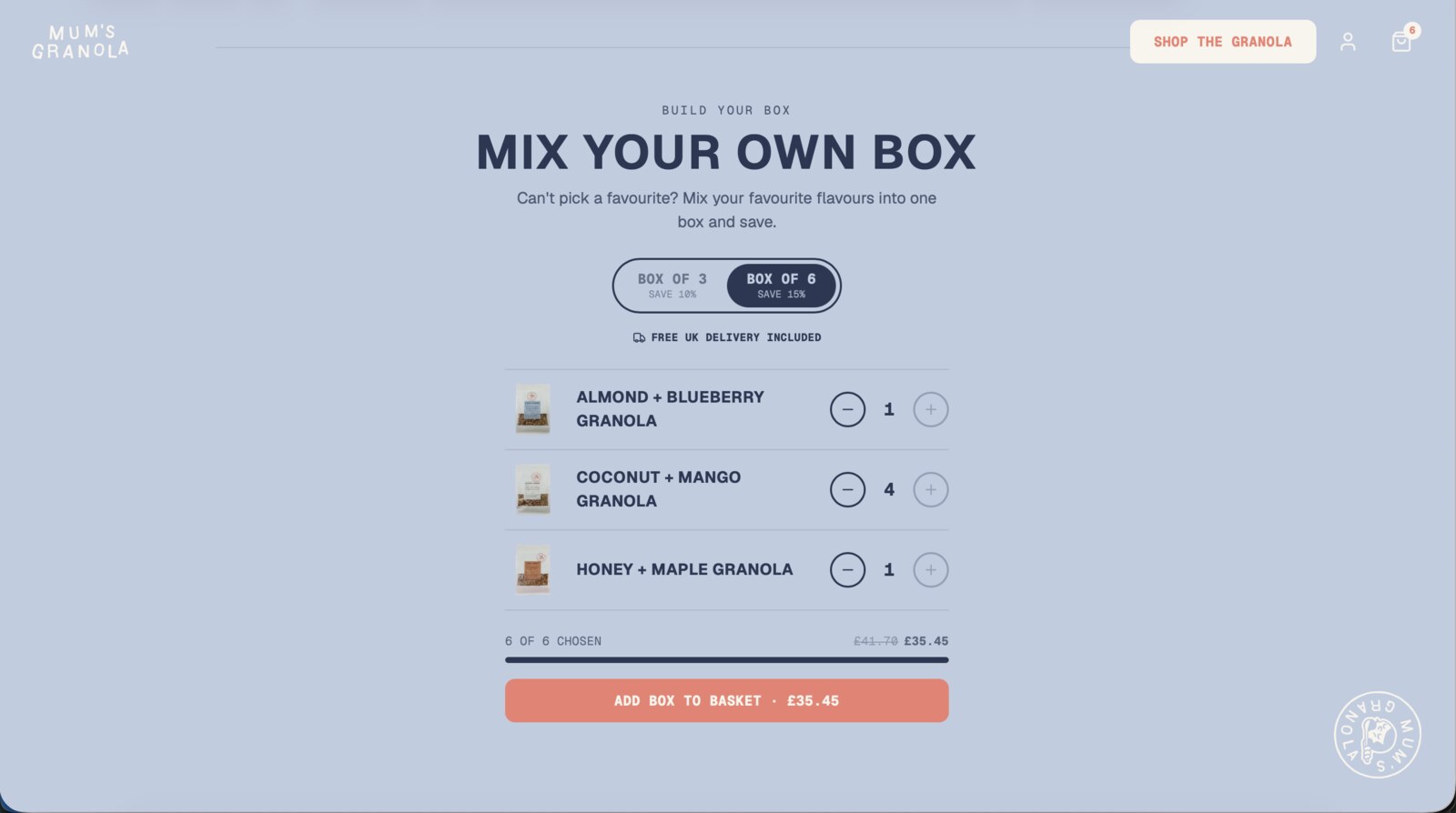
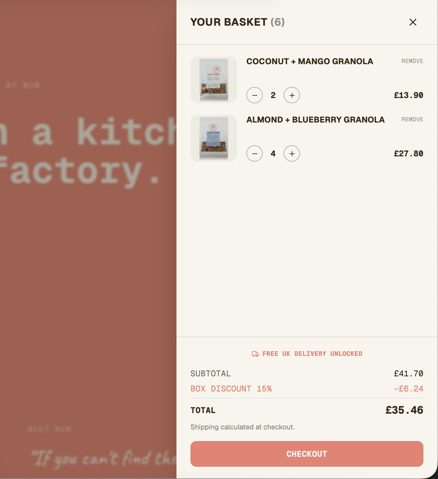
Commerce runs on headless Shopify. Live products and prices, a slide-out basket, one-time or Subscribe and Save on every flavour, and a mix-your-own box that saves more at six with free UK delivery built into the choice. The basket does the maths in the open, showing the box discount and the delivery threshold before checkout rather than springing them at the till. Checkout itself is Shopify's, so payments, subscriptions and orders are handled by the platform mum already owns.
The part that matters most sits in the admin she already uses. Every word, price and image is editable by Esther in Shopify. The copy lives in Shopify metaobjects, the products and prices are Shopify's own, and the pack shots are pulled from each product, so she updates the whole site from one place, with no second system and no developer. Around that the site ships with SEO, structured data, a sitemap, consent-gated analytics and the legal pages.
Brand integration
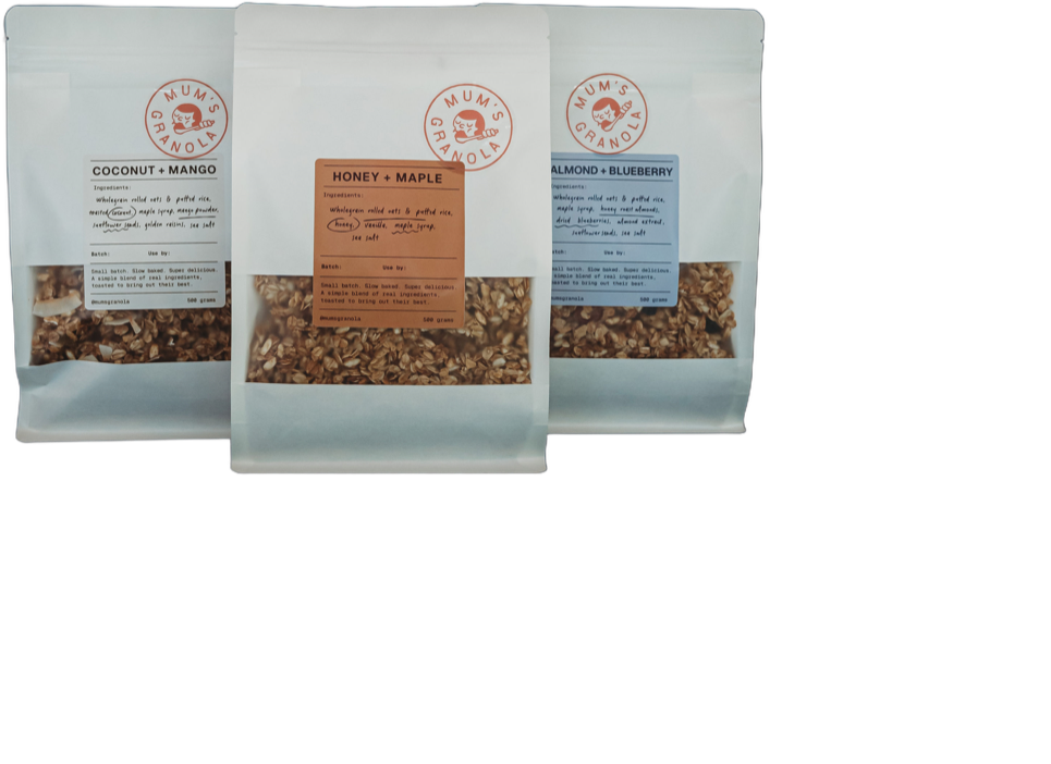
The identity was already locked, so we poured it into the build rather than redrawing it. Coral and milk carry the whole site, with earth and a deep cocoa for depth, Geist Mono for the signature headlines, Geist Sans for the body, and a handwritten accent for mum's own voice. The circular stamp, the mascot and the hand-drawn devices come through exactly as the brand intends. It reads as Mum's Granola from the first scroll, and as the product itself the moment you see the packs.