Brief
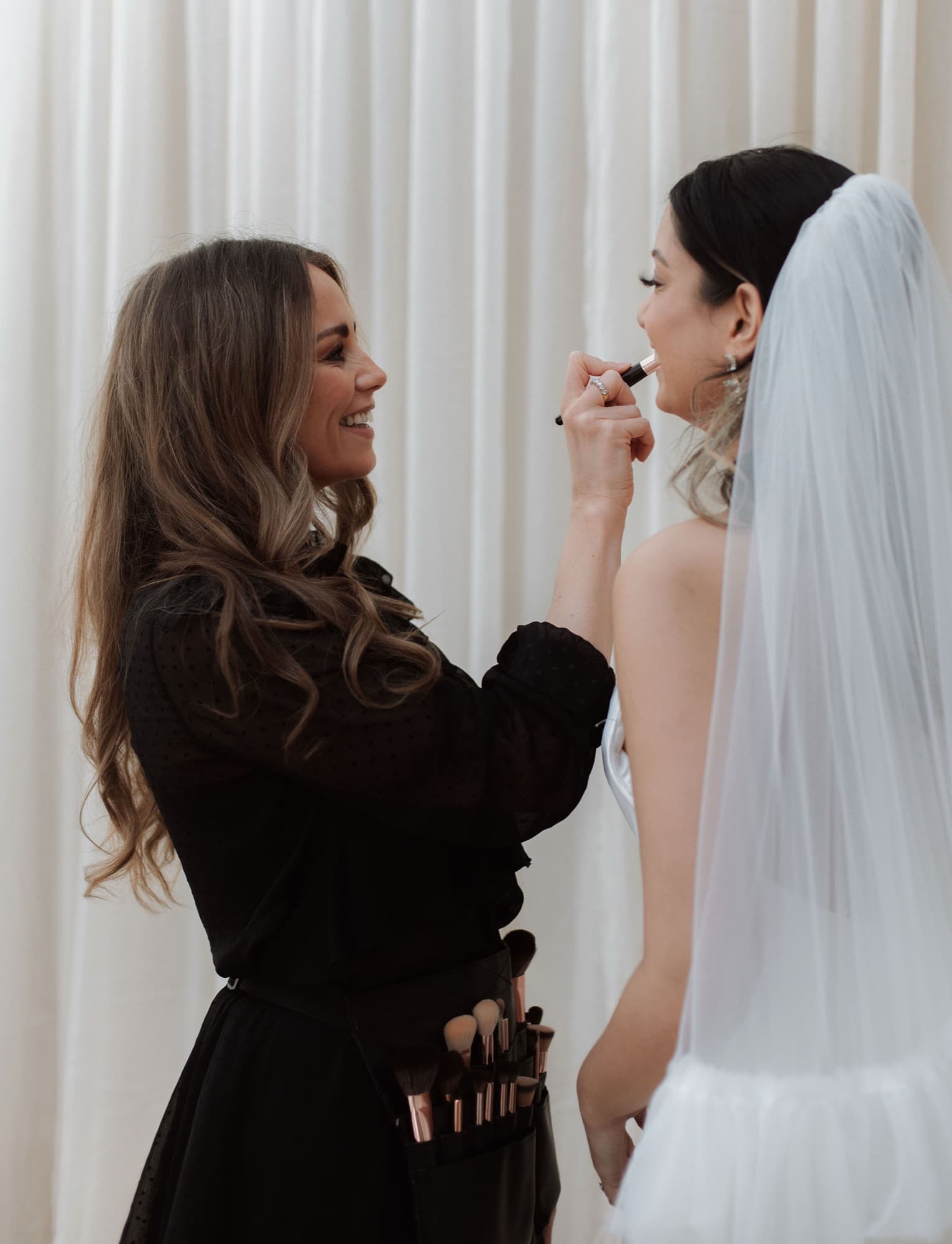
Abigail spent seven years at Charlotte Tilbury before going freelance. She left with luxury-beauty technique and a working-MUA client list, bridal, editorial, prom, party. Her old website was thin: a contact email and a few Instagram screenshots. It wasn't winning enquiries; it was hiding from them.
The brief was to build a marketing site that did one thing well: turn site visitors into enquiry-form submissions. Not a portfolio for fellow MUAs to admire, not a shop, not a blog with weekly posts she would never write. A booking funnel, dressed up in a brand that looked as expensive as her work.
Approach
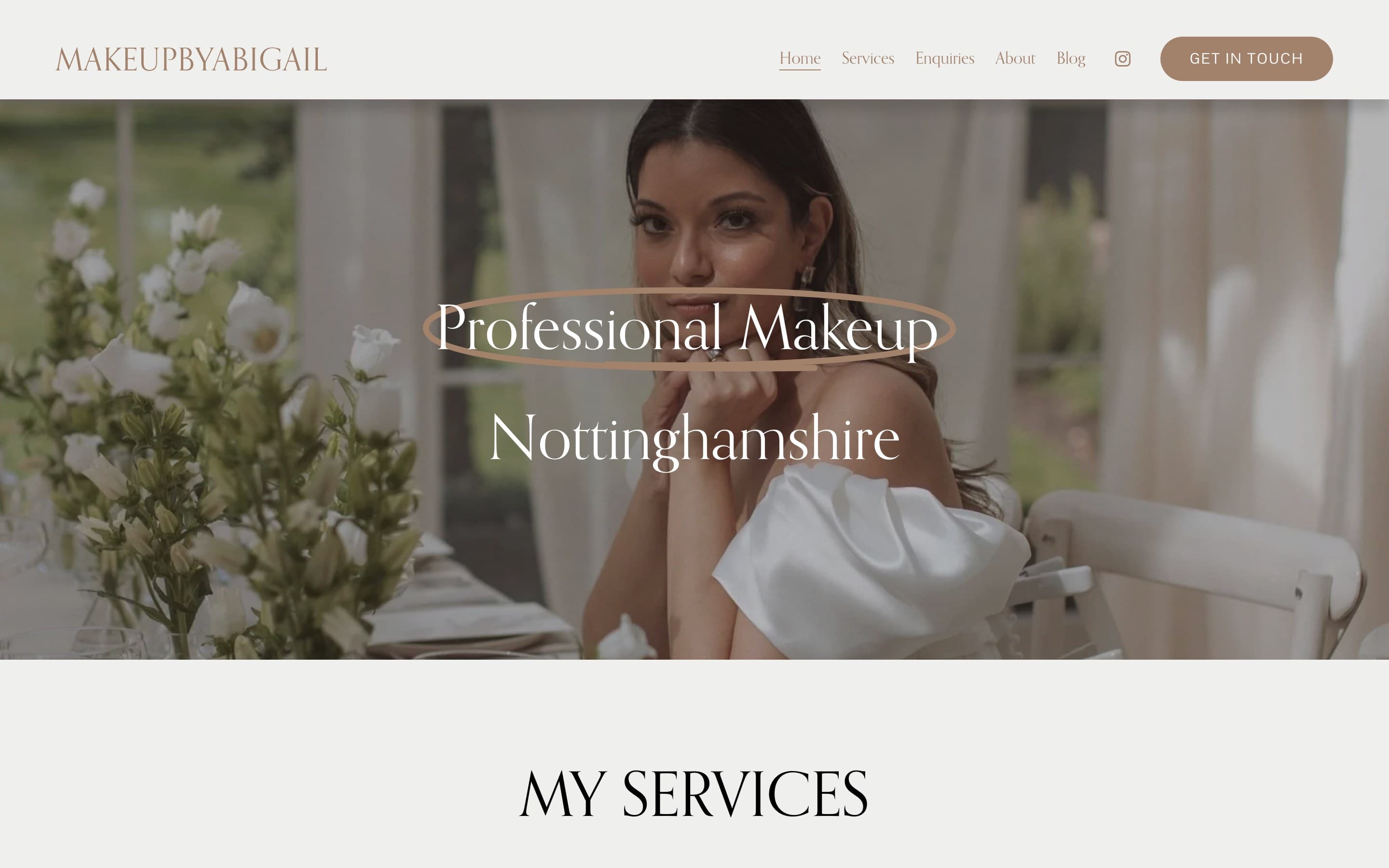
The site is built as a photography-led marketing funnel. Every page is structured around a single conversion path: see the work, read the testimonials, fill in the enquiry form. There are six pages total, Home, Services, Enquiries, About, Blog, Instagram, but four of them exist only to lead to the fifth.
The platform is Squarespace with the defaults torn out, the right tool for a sole trader who needs to update her own copy and add new portfolio shots without calling a developer. The work was in the brand and the restraint, not the stack.
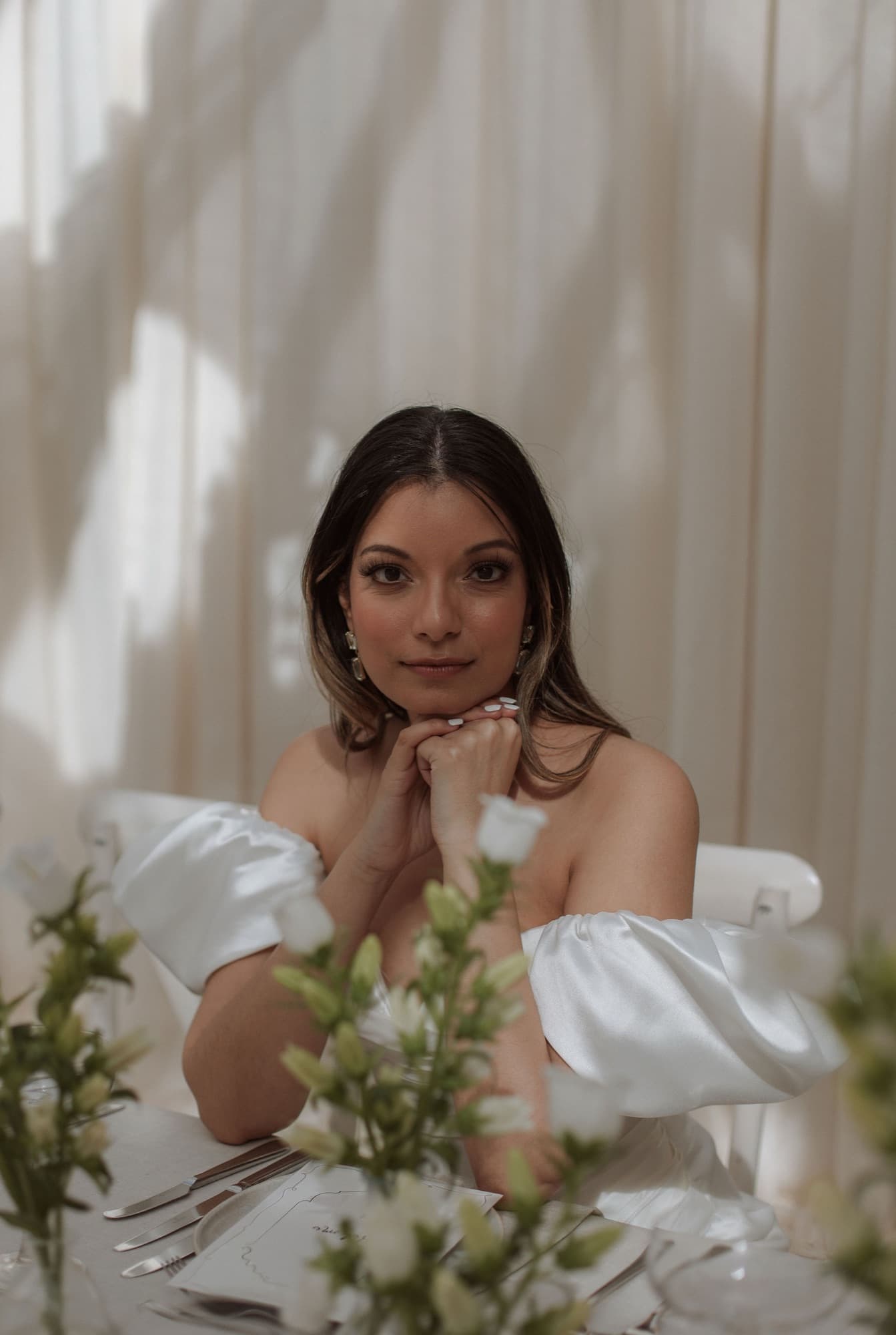
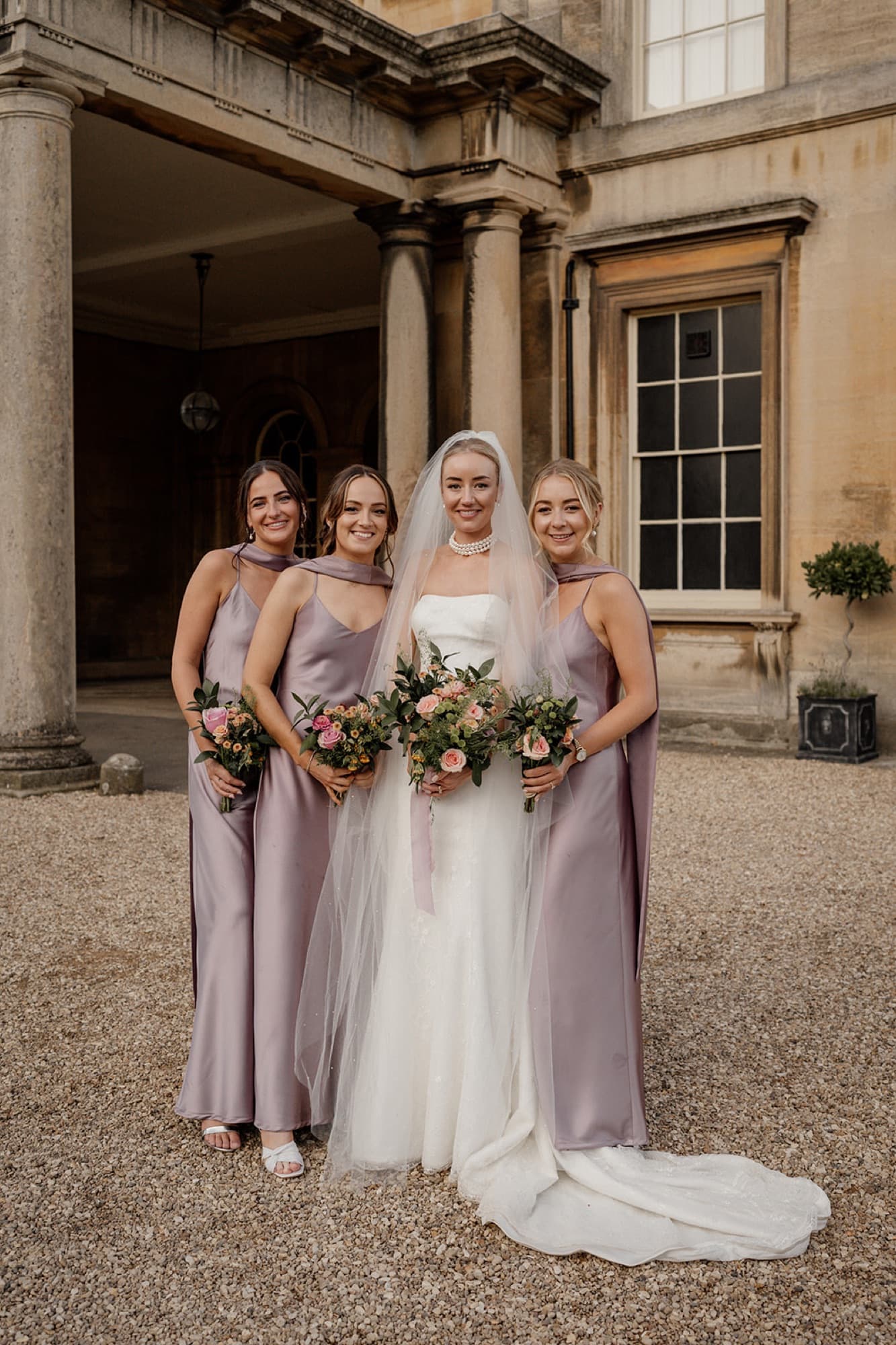
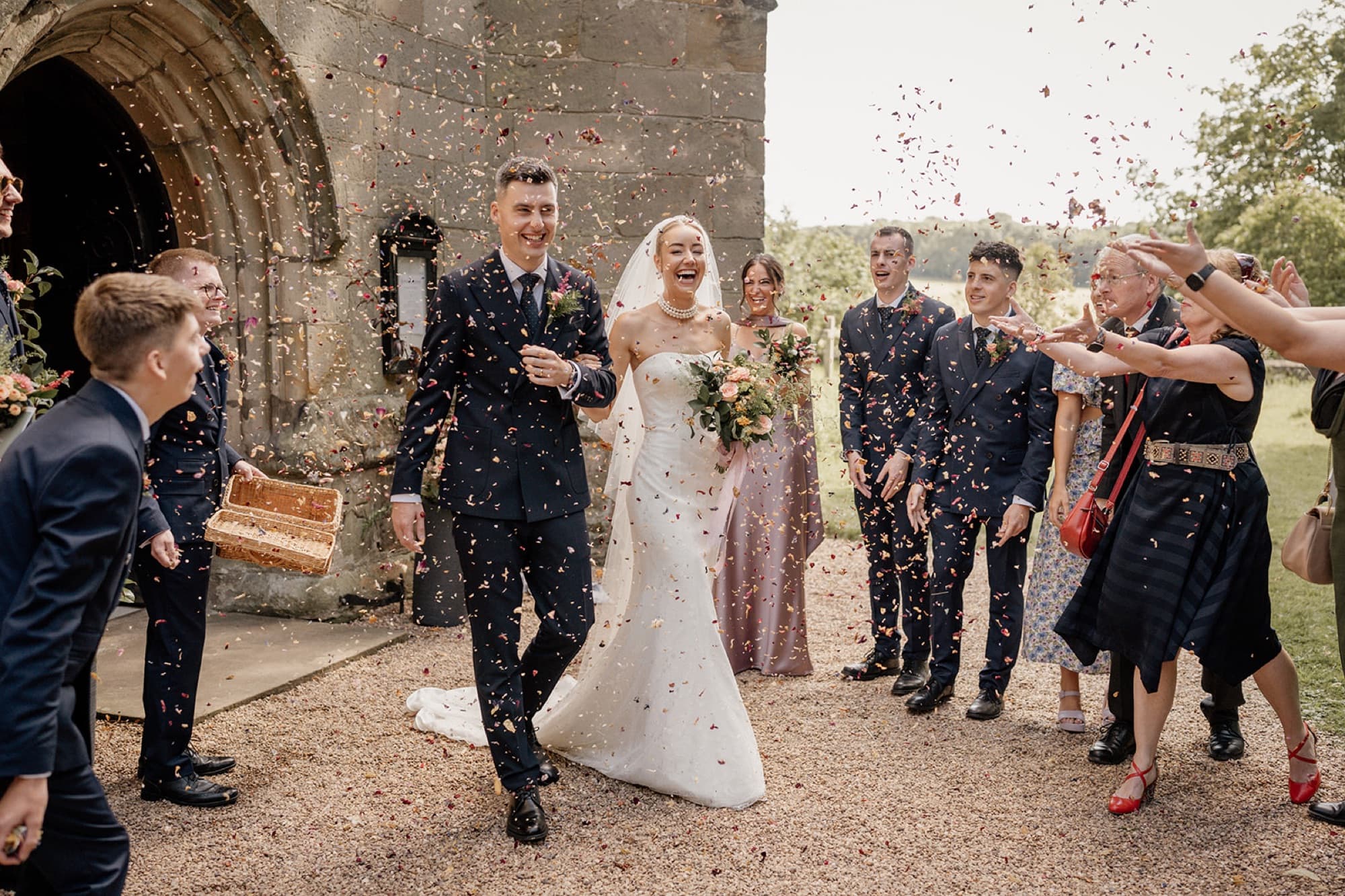
The visual system is restrained on purpose. Warm taupe, an editorial serif, full-bleed photography. No accent colour, no animation tricks, the photography is what should command the screen. Whitespace is generous because luxury beauty sites look expensive when they breathe and cheap when they don't.
The enquiry form is the most considered interaction on the site. It captures everything Abigail needs to give a fast, accurate quote: event type, date, location, number of faces, notes. The easy questions come first; the harder ones come last, once the visitor is already invested.
A few deliberate omissions:
- No pricing, bridal makeup is sold through consultation, not a price page. Pricing on the site would attract the wrong leads and kill the right ones.
- No automated booking calendar, same reason. Abigail wants to triage enquiries by hand and quote against availability.
- No "About me as an artist" essay, the testimonials and the work do that job better than a 600-word bio could.
Outcome
Real metrics belong to Abigail, but the brief was satisfied: every page rolls into the enquiry form, the photography is the hero, and the brand finally looks like it belongs in the same conversation as the names on her CV.
This is the smallest project in the portfolio. It's also the clearest demonstration of the principle I keep coming back to, most websites get ruined by what they include, not what they leave out.